


Awarded First Place
Yervana x Iterate UX
Research Challenge, 2022
How it Started
__
Based in Vancouver, BC, Yervana aims to create an online adventure booking experience that appeals to everyone with an adventurous soul. Their options include everything from whale watching to bike and brewery tours to zip-lining through the forest.
Yervana partnered with the Discord server Iterate UX to research and recommend improvements to their search function.
Yervana wanted to research why user conversion was low after users conducted a search, and how they could improve their search results.

Initial affinity diagraming
How it Went
_
We had 4 weeks to research and present our project, which was done both in-person to stakeholders, and as a video.
Challenges: TIME, coordination, user interview drop-off, lack of site data metrics.
Research Process
-
Competitive analysis
-
Moderated usability study
-
Affinity mapping
-
User personas
-
Journey mapping
-
Mockup of recommendations
My Roles
__
I stepped up as project lead. My responsibilities included:
-
creating the research plan
-
writing the interview survey
-
conducting interviews
-
leading the affinity diagram session
-
creating the Figma mockups
-
guide the structure of presentation
Shout out to team 13:
Ming Zheng, Jennifer Chen, and Jenny Woo

Recommendation: create icon bar

How it Ended
__
Result
We made over 25 recommendations, notably:
1. mapped results
2. category icon bar (& more icons in general)
3. social proof expansion
4. broaden search terms
Yervana chose our team as the winners of the research challenge, citing our recommendations and mockups as the main reasons why.
The Full Project

Problem Brief
__
Yervana wanted to improve their search function. In the initial briefing, we learned:
-
Users were dropping off after conducting a search.
-
Development tried a number of small tweaks, with limited success.
-
Users ranged from bachelor parties to solo student travellers to empty nesters, and had a wide range of needs.
Hueristics and "tearing the site apart"
__
Our project mentor Mandy Cabellon suggested we start this way: make a long list of all the issues-- even if everything looks great, there are always elements to improve. "Be brutal. Tear the site apart." she said. (This was a huge takeaway!)


Competitive Analysis
__
We took a look at how other sites are addressing their search functionality. Our biggest informers were AirBNB, Travelocity, and Adventure Guides.
We learned a lot, and borrowed some patterns and UI from some to use in our recommendations.
User Research
__
Our next step was to conduct interviews and usability testing with users. We reached out to the adventure-loving community to find out what they wanted and why when it came to booking an adventure.
Since time was limited, we had our users conduct a usability test on the site to find areas to improve in the search function.

Our Participants
__
Our ideal users are people who have booked adventure trips in the past 12 months, such as biking, mountain climbing, whale watching, etc.
We did a moderated zoom call, with 2 men and 4 women.
* I hoped to speak more "empty nesters," as Yervana said that was part of their customer base but we were unable to recruit any.
Interviews
__
Some questions we asked:
-
How do users find adventures?
-
What are they looking for when they book an adventure?
-
Who do they trust?
-
What experiences did they have booking the adventures that were positive, negative, or interesting?
Usability Test
__
We had our users conduct searches:
Search 1:
Look for a biking adventure for four people in Vancouver in April.
Search 2:
Look for an adventure of your choice.
Findings
__
We had a few surprises, and a few predicted outcomes.
Taking a look at the data as a group really helped us get a way to identify patterns.
Visuals Rule
__
Several of our users found adventures based solely on location-- they walked by a sign near their rental property and booked it right there.
Users often booked based on images from social media, like a POV from a GoPro camera, and during the usability test, often chose adventures with an engaging cover photo.
Users also responded to the parts of Yervana's interface that had lots of icons, such as the category drop down menu, or the adventures with star ratings, badges, etc.

Results were confusing or irrelevant
__
Several of our users tried a search term and got no results for it, even though it seemed clear there were better options.
For example, one user typed in "orcas" (a type of whale from the Pacific), and got no results, even though there were several whale watching tours available.
Additionally, the search terms seemed to have varying relevance as a user continued to search, and users were confused at the returns.

Social Proof
__
Many of our users booked their adventures based on recommendations from friends.
It's pretty reasonable: if you're going to trust someone to take you on a dangerous adventure, you want to be absolutely sure they're trustworthy!
Users gravitated to adventures that had star ratings, lots of information about the guide/company, and good, clear maps of the adventure.

Ideation
__
We had an epic brainstorm session creating our affinity diagram and finding patterns in our user's searches for the right adventure.
After creating user personas and journey maps to guide us, we were ready to make our recommendations.
Affinity Diagram: My Favorite Part
__
Why? Because working together worked wonders.
Up until this point in the process, our team was communicating on text messages and through shared files. We hadn't had much chance to work together!
So we spent a Friday night working on our Figjam board together, and came to some great understandings.

Affinity diagram, created in FigJam


User personas & user journeys


Recommendations
__
We fought hard, climbed to the top of the mountain, forded streams, and came up with our recommendations, presented to Yervana's team on November 28th, 2022.
Core Insights
1. Visual Interface
Users need more visual engagement and graphic features to stay engaged and make decision-making easier
2. Search Results
Results were inconsistent and confusing, causing users to abandon the site.
3. Descriptions
Users trust other users and recommendations when it comes to booking adventures.
“ A map where it pinpointed a bunch of different things that are popular? That'd be pretty cool. That would make it easier for me to decide” -Yumi

1a. Visual Interface
__
Create an interactive map of results
Based on the insight that most users choose their adventure based on their location, we suggested adding a map of results.

1b. Visual Interface
__
Incorporate iconography for categories
Every. User. Gasped. when they saw the array of adventure categories. It's a great way to advertise what's available internally, and it sparks delight, engagement and hopefully, conversion!
2a. Search results
__
Expanded search vocabulary
Users wouldn't get appropriate results with their searches, so expanding the search terms that would return relevant results would be helpful
BIKING
TRAIL RIDING
DIRT BIKE
CYCLE TOUR
RECUMBANT
TOURING
2b. Search results
__
Present results relevant to search clearly:
"breadcrumbs"
In order to reassure users they're getting what they're searching for, show the accurate "breadcrumb" trail.
“I don’t see any pictures of bikes on here” (user searched searched trail riding)

3. Descriptions
__
More informative descriptions of search results: social proof.
detailed maps, info about trails, ratings, badges, reviews, video clips-- the more the better.

Our recommendations in action
Home page
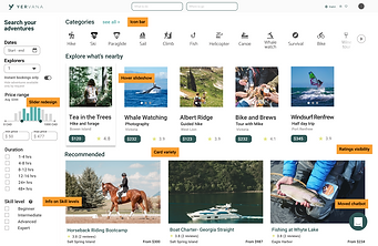
-
card variety
-
price slider detail
-
hover slideshow
-
ratings
-
information on skill levels
-
chatbot moved
Results page

-
map of results
-
clear visual of search terms
-
area map and recommendations
-
relevant results
Detail page

-
icon-heavy tour information
-
reviews
-
guide info: badges
-
detailed maps and routes
Prioritization
__
With our suggestions, we created a prioritization matrix. Some recommendations would be easier to implement than others!

Closing remarks, next steps, and feedback
__
The team at Yervana was very encouraging and open to our suggestions. They appreciated our user research methodology, and agreed with our solutions in the UX patterns we chose to highlight.


Feedback
__
Yervana especially cited these items in their feedback:
Positive:
-
Category icon bar- a modern UI patterns that's proven to be effective.
-
Breadcrumb trail- already in the process of implementation.
-
Card size variety- a good way of creating hierarchy on the page.
-
Local area guide- a good alternative to mapping.
Needs Work:
-
Mapped results would not be feasible based on their current site structure.
-
The detailed price slider wasn't a big improvement, and seemed unnecessary.
Next Steps
__
We suggested a few steps further down the line to better leverage Yervana's product.
-
Improve mobile experience: most users are on mobile, and their interface wasn't fully responsive to mobile screens.
-
Work on expanding adventure guide information gathering from the onboarding process. Best to start with great data!
-
move chat button so it doesn't cover important filter input fields.
Closing Remarks
__
Overall, I feel Team 13 worked really well together.
Our challenge was to work in a short time frame to recruit users and conduct user testing.
But our insights were solid and evidence-based, which I feel gave us a great set of recommendations.


